Charmick / Visual identity
Quiet confidence.
Lasting character.
A brand shaped by the relationship between architecture and everyday life. Grounded, expressive and intentionally restrained.
Building & interior design
01 / The mark
An open invitation.
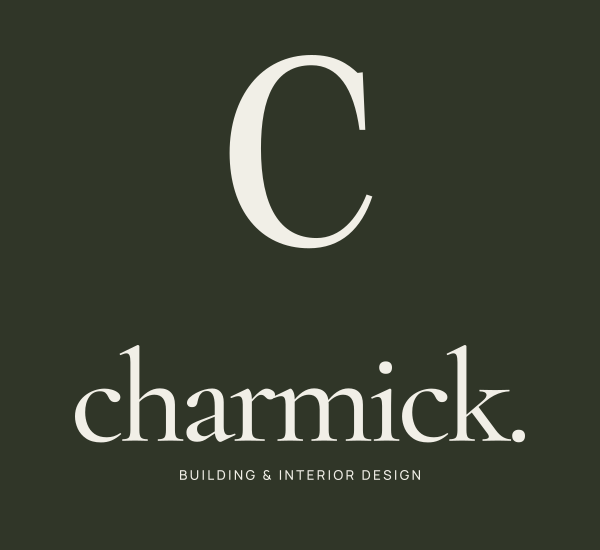
The original Charmick “C” is drawn as an open, sculptural form. Its contrast of weight and fine detail echoes the balance of substance and softness in a considered home.
A lowercase wordmark brings warmth and approachability. The full stop gives the identity a sense of intention: every detail, resolved.
02 / Colour
Drawn from nature.
Olive
#303628
Limestone
#F1EFE7
Moss
#92977E
Warm stone
#E5E2D8
Deep forest
#20261C
03 / Typography
A conversation in contrast.
Cormorant Garamond
An expressive editorial serif for the wordmark, statements and project names. Regular and italic forms create a measured rhythm.
Manrope
A clear, contemporary sans serif for navigation, captions and body copy. Generous spacing gives the identity room to breathe.
04 / Language & imagery
Considered by nature.
Speak with clarity, warmth and restraint. Focus on the feeling of home and the choices that create it. Let the work carry the story.
Use real project photography at a generous scale. Seek natural light, tactile details and the connection between inside and out. Pair deep olive with warm ivory for an understated editorial feel.
05 / Brand assets